It is fixed and versatile, classic and trendy, bold and conservative. It is English and Latin. It is instantly recognizable but hard to reproduce. It is ubiquitous and mysterious. Behold: It is the great and powerful ampersand.
WORDS: CHARLIE KEATON

The ampersand, that squiggly conjunctive logogram and erstwhile 27th letter of the alphabet, is really hitting its stride. Once a bastardized character of convenience, it now props up major corporate logos and restaurant names, even serving as a standalone design icon in its own right. Never mind that it dates back 2,000 years. The ampersand is so ubiquitous in the world of modern design that it’s often taken for granted, or dismissed entirely. But as any creative director or linguistic historian will tell you, to know the ampersand, to grapple with its origins and eccentricities, is to love it. Such staying power is remarkable for a character that owes its existence to the lazy writing habits of first-century Romans. Back then, when writing the word et (Latin for “and”) in cursive, the individual letters “e” and “t” would often get linked. Gradually, that amalgam became its own character, and by the early 19th century, the English language had adopted it, as well. Teachers tacked it on the end of the alphabet, so that children reciting their ABCs would finish not with “Z,” but with “and.”
Except it’s confusing to say, “X-Y-Z-and.” So instead, they added the phrase per se, which loosely translates to by itself. Now, instead of “X-Y-Z-and,” the alphabet concluded with “X-Y-Z and per se and.” It was only a matter of time before that tongue-twister became a single word: ampersand.
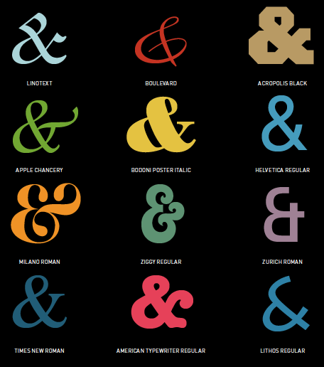
Due in part to its longevity, the ampersand has seen its share of typographical variations. Many fonts render it in such a way that the ancestral “e” and “t” are still recognizable. Rick Griffith, head of Denver design outfit MATTER, believes that the flexibility of the form is part of the appeal. “Anything that looks like an ‘e’ opens the door to new possibilities,” he said and points to the Caslon typeface as a definitive interpretation.
Kyle Warfield, a designer at MATTER, agrees that the elegance and beauty of Caslon (as rendered in Adobe Bold Italic) is special. “Its orientation looks like it’s leaning, and that creates a kind of tension,” he said. “It has this feeling of being in motion, like it’s almost rocking onto its back in the way the forms come together. It feels very active and alive.” In a less traditional vein, he cites Acropolis for its menacing aesthetic—all sharp cuts and negative space, with no smooth lines to be found.
But how can a single character enjoy so much unchecked variance? Warfield has a theory. “I think it has to do with originally being drawn by hand and the way the script minimizes the amount of strokes in the letter form, so you start to make fewer corners and turns, and to create new ligatures,” he said. “It starts to transform into something that doesn’t always resemble the original character.”
Elegant or menacing, the ampersand has evolved beyond its conjunctive function into a full-fledged staple of modern design. Major international brands like Dolce & Gabbana, H&M, and B&B Italia utilize the ampersand as the foundation upon which to construct their logos. It is as much a part of their brands as the words surrounding it. Closer to home, a spate of Colorado bars and restaurants— from Beatrice & Woodsley to Stoic & Genuine—have followed suit.
So why does the ampersand still command so much attention after all these years? Griffith attributes its staying power to the beauty and simplicity of its form. “For us, it’s a symbol for ‘what else?’ It’s almost like an ellipse, except there’s an economy to it,” he said. “The ampersand doesn’t close something. It opens something. It’s like a plus on steroids.”
[divider scroll_text=””]
 AN APPETITE FOR AMPERSANDS
Denver’s culinary scene has exploded in recent years, attracting chefs and restaurateurs from all over the country. The menus are diverse and wide-ranging, but quite a few of these newcomers share a familiar brand characteristic. Here are a few dining destinations that make creative use of the ampersand:
BABA & POP’S KITCHEN // BEAST & BOTTLE // BEATRICE & WOODSLEY // BLOCK & LARDER // BRAMBLE & HARE // BULL & BUSH // CB & POTTS // COLT & GRAY // CREPES & CREPES // FORK & SPOON // GUARD & GRACE // HEY PB&J // HOPS & PIE // HUTCH & SPOON // LEAF & CRUMB // MILK & HONEY // OLIVE & FINCH // ROOSTER & MOON // SALT & GRINDER // SHELLS & SAUCE // STOIC & GENUINE // WILLIAMS & GRAHAM // WORK & CLASS


